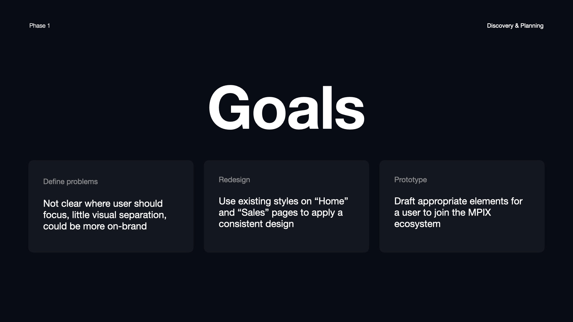
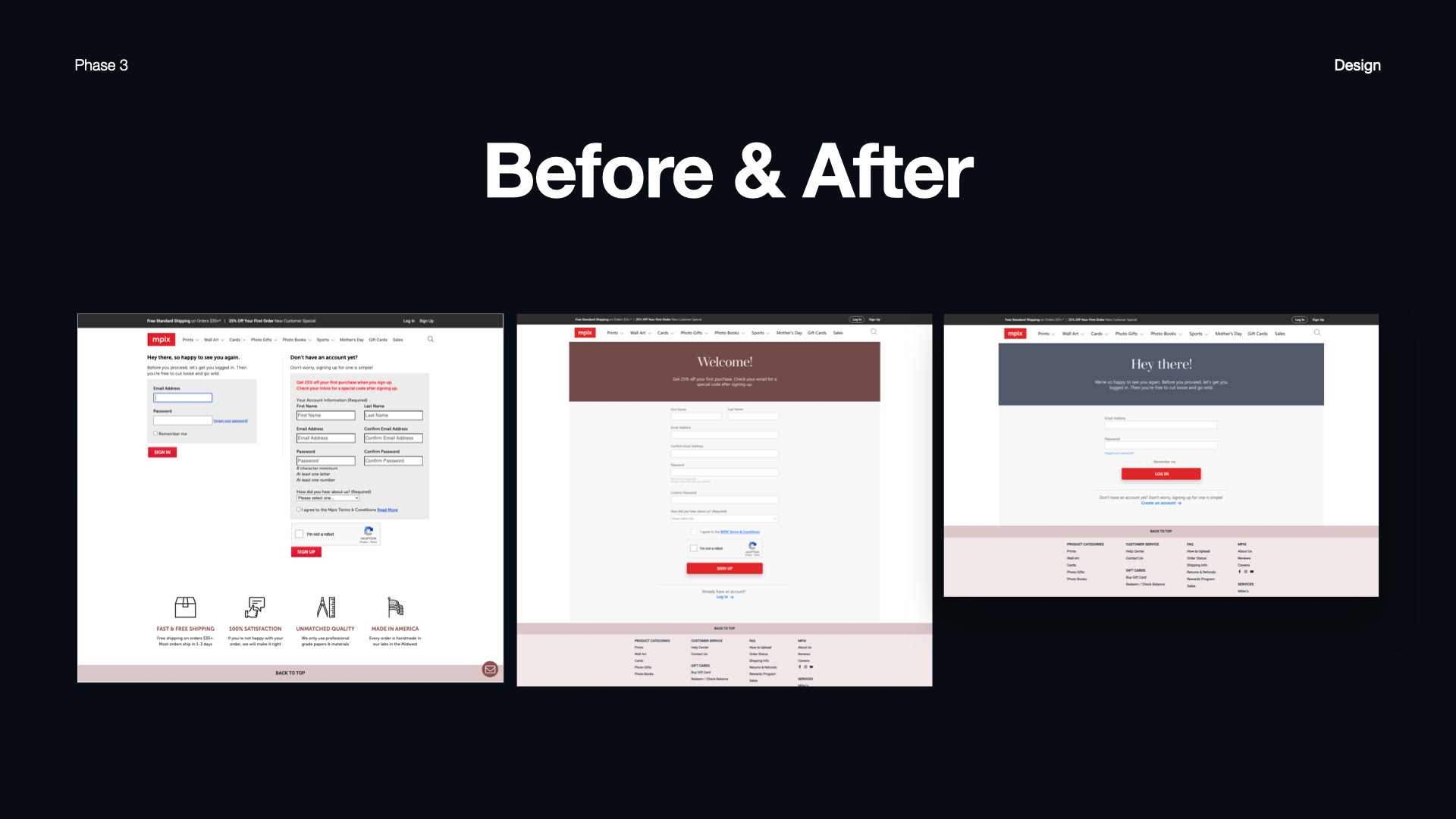
issue:
miller's professional imaging, in the process of updating their mpix brand, hastily created their login and signup flow. they conveyed this to me, and that they would like to update their customer onboarding pages to be less confusing and more in line with their visual guidelines.
miller's professional imaging, in the process of updating their mpix brand, hastily created their login and signup flow. they conveyed this to me, and that they would like to update their customer onboarding pages to be less confusing and more in line with their visual guidelines.
my role:
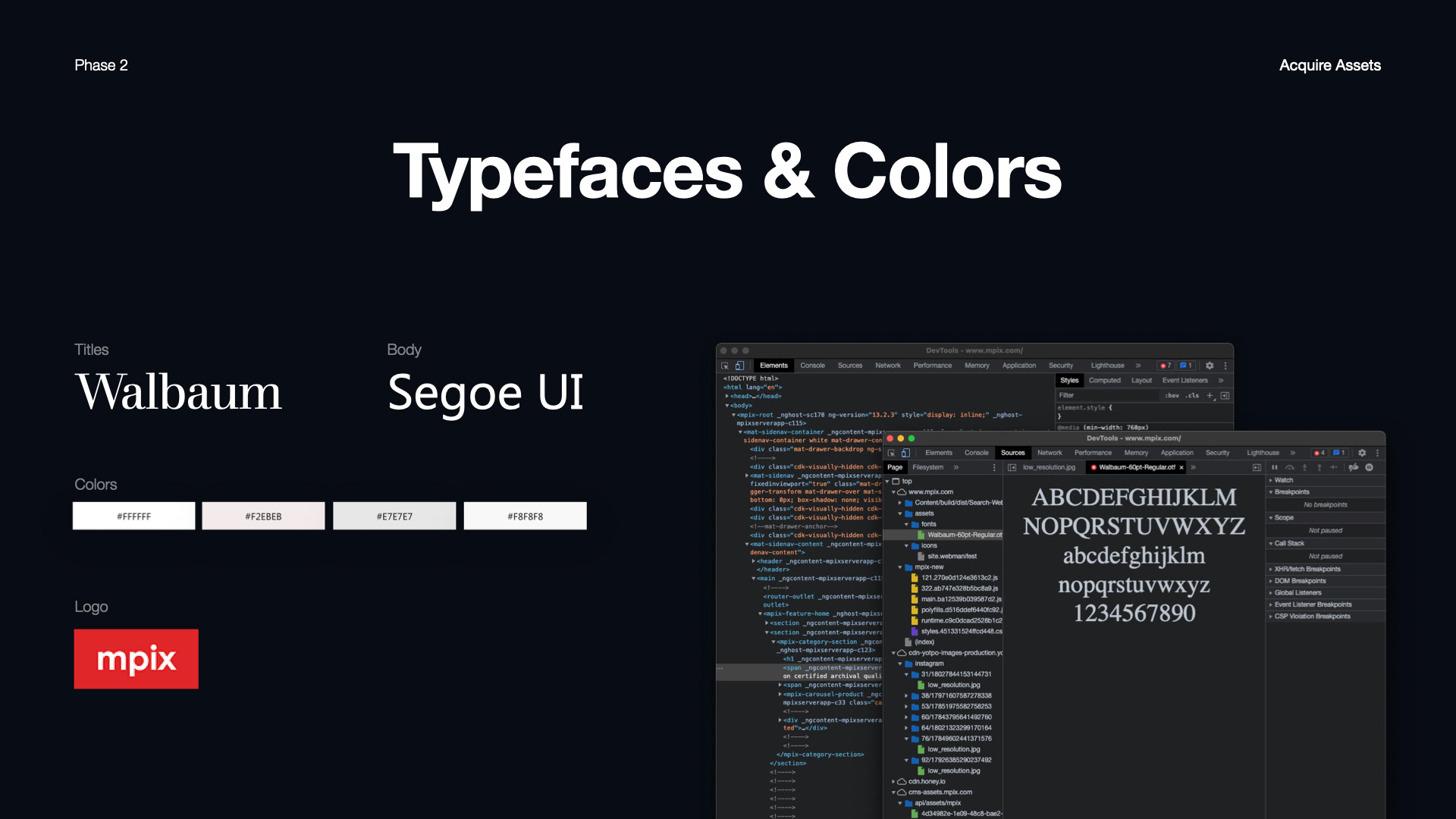
over the course of two weeks, the art director and myself worked together to establish a visual direction, and determine the number of pages needed so as to make it as easy as possible for the software team to update the site. i handled all asset creation, using mpix's visual style guide.
over the course of two weeks, the art director and myself worked together to establish a visual direction, and determine the number of pages needed so as to make it as easy as possible for the software team to update the site. i handled all asset creation, using mpix's visual style guide.
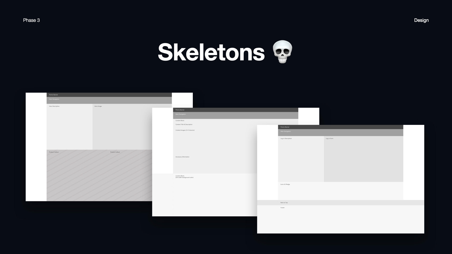
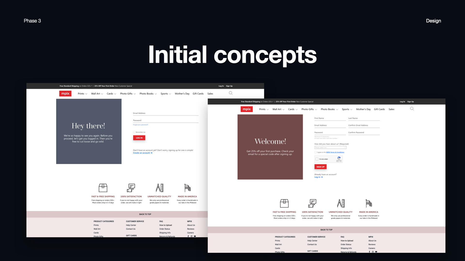
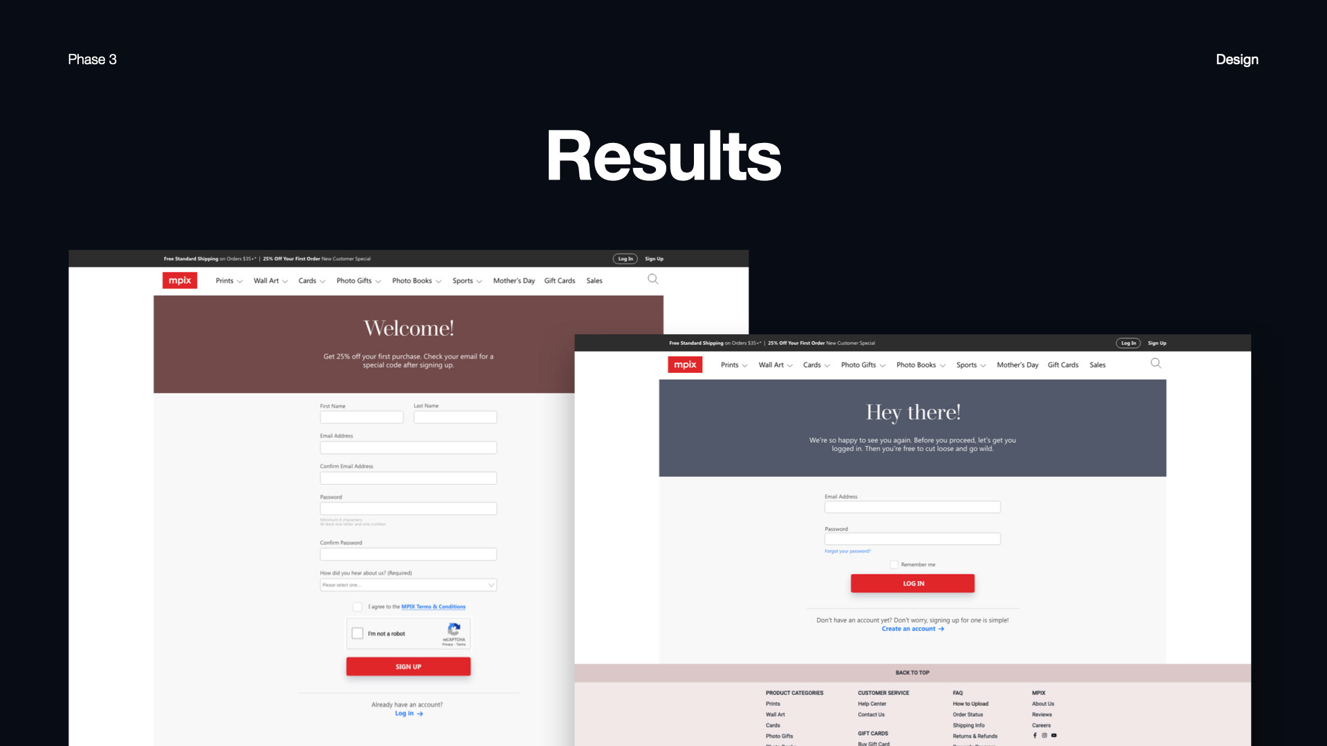
solution:
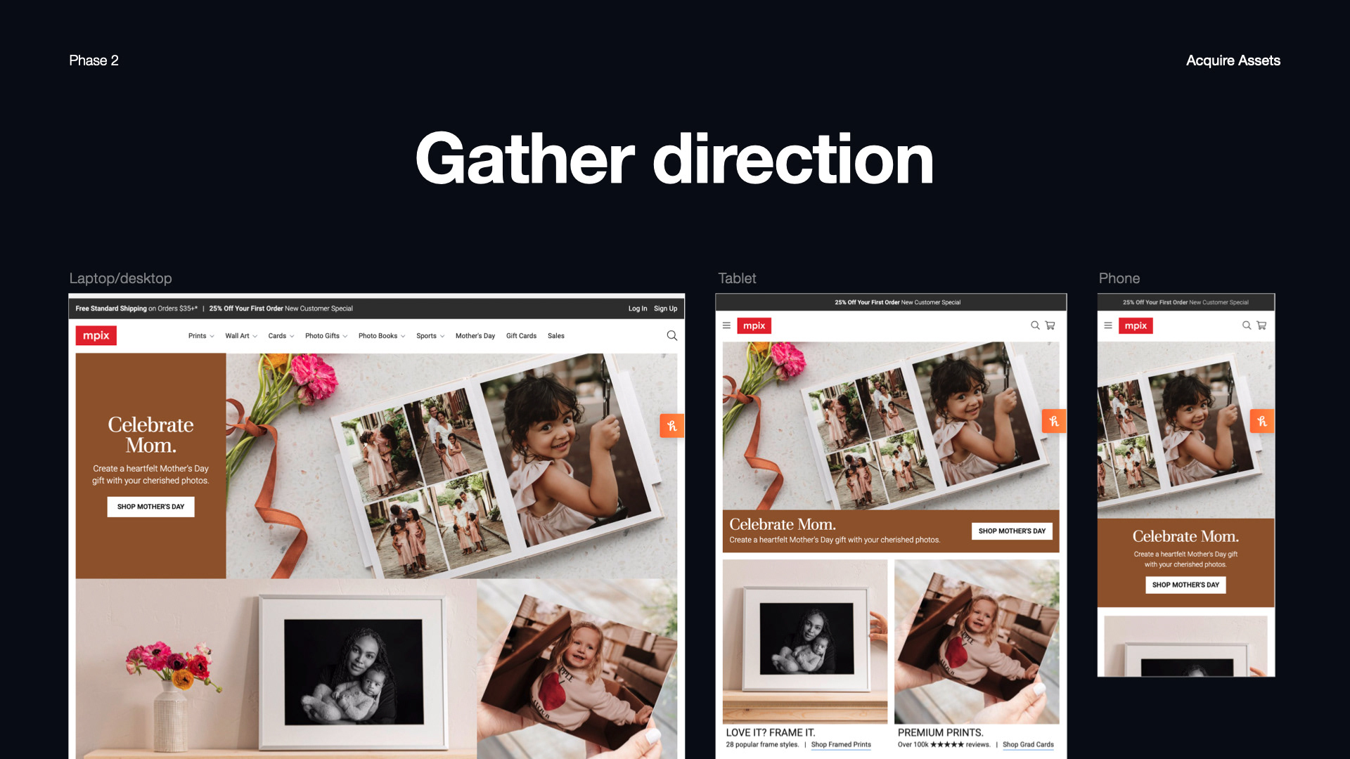
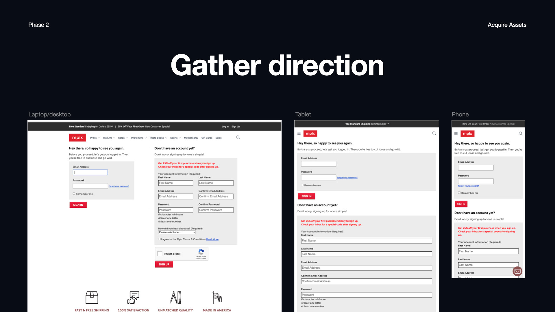
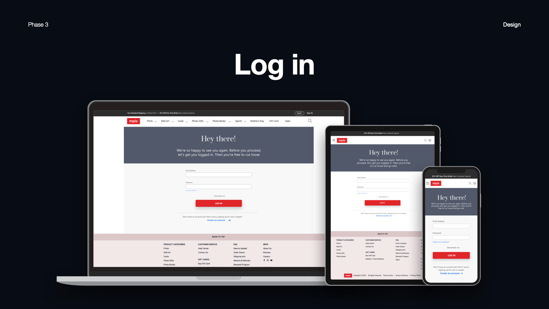
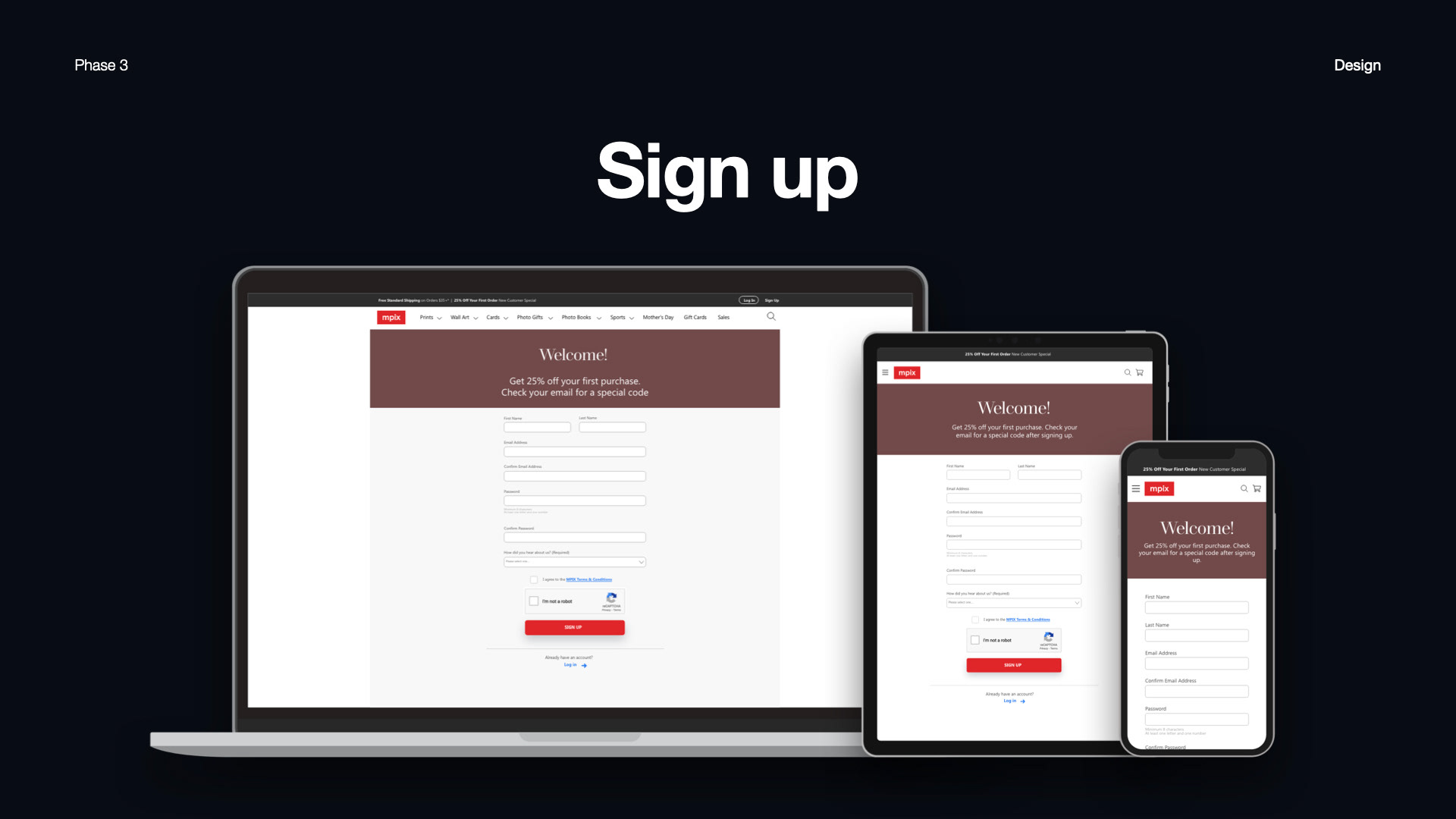
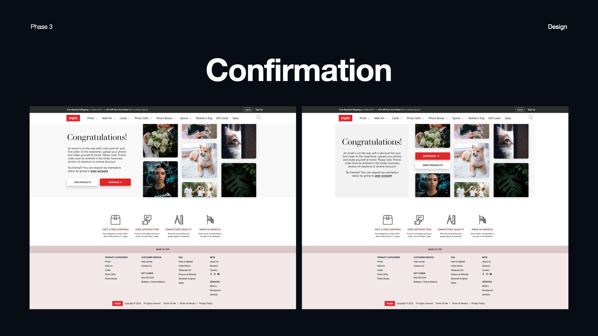
i proposed a two-page design: one for sign up, the other for log in. as seen below, having both on one page was quite cluttered. i reached the end design fairly quickly, and each additional page fell into place in short order.
i proposed a two-page design: one for sign up, the other for log in. as seen below, having both on one page was quite cluttered. i reached the end design fairly quickly, and each additional page fell into place in short order.